Key Takeaways
- Home colors and emotions can influence mood, comfort, and the overall feel of a room.
- Warm colors create energy and warmth, while cool colors encourage relaxation.
- Bedrooms benefit from calming shades like blue and green.
- Home offices work well with colors that improve focus.
- Lighting changes how paint colors appear throughout the day.
- Always test paint samples before making a final decision.
- Balance trendy colors with timeless neutrals for lasting appeal.
- Choosing colors based on a room’s purpose leads to a more comfortable and enjoyable home.
Quick Answer
The connection between home colors and emotions comes from color psychology, which explores how different shades influence the way people feel. Soft blues and greens often create a calming atmosphere, while yellows can bring warmth and optimism. Reds tend to feel energetic, and neutral colors offer flexibility and balance. Choosing the right wall color for each room helps create an environment that matches its purpose, whether you want to relax, focus, entertain guests, or sleep better.
What Is Color Psychology in the Home?
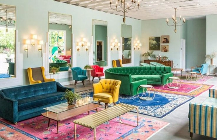
Color psychology home refers to the way colors influence emotions, behavior, and perception within living spaces. While color cannot completely control how someone feels, it can encourage certain emotional responses that make a room feel peaceful, lively, cozy, or spacious.
Think about walking into two different bedrooms. One has soft blue walls with natural light, while the other has bright red walls and bold decorations. Even without thinking about it, most people experience each room differently. The blue room often feels calm, while the red room feels more energetic.
That is why color plays such an important role in interior design. It works together with lighting, furniture, textures, and décor to create the overall atmosphere of a home.
Several factors influence how colors affect people, including:
- Natural and artificial lighting
- Room size
- Paint finish
- Furniture colors
- Personal preferences
- Cultural background
Because of these factors, the same paint color may feel slightly different from one home to another. Testing paint samples before committing to a full room is always a smart decision.
Why Home Colors Affect Your Emotions
The human brain constantly processes visual information, and color is one of the first things it notices. Different colors can influence how welcoming, spacious, relaxing, or energetic a room feels.
Although emotions are personal, many people respond similarly to certain color groups.
| Color Group | Common Emotional Response | Best Used In |
|---|---|---|
| Warm Colors | Energy, excitement, comfort | Kitchen, dining room, living room |
| Cool Colors | Calmness, focus, relaxation | Bedroom, bathroom, office |
| Neutral Colors | Balance, simplicity, flexibility | Almost every room |
| Dark Colors | Drama, elegance, intimacy | Accent walls, larger rooms |
Instead of choosing colors only because they are trendy, think about how you want each room to make people feel. A relaxing bedroom usually benefits from different colors than a creative workspace.
How Different Colors Influence Your Mood
Every color brings its own personality into a room. Understanding these emotional effects makes choosing paint much easier.
Blue
Blue is one of the most popular choices for homes because it creates a peaceful atmosphere. It often reminds people of the sky and the ocean, making spaces feel open and refreshing.
Blue works especially well in:
- Bedrooms
- Bathrooms
- Reading corners
- Home offices
Lighter shades encourage relaxation, while deeper blues create a sophisticated appearance without feeling overwhelming.
Emotional Effects
- Calm
- Peaceful
- Relaxed
- Focused
- Comfortable
Green
Green represents nature, balance, and renewal. It is easy on the eyes and creates a refreshing environment that works in almost every room.
Many homeowners choose green because it combines the calming qualities of blue with the warmth of yellow.
Green works well in:
- Living rooms
- Bedrooms
- Home offices
- Dining areas
Emotional Effects
- Balanced
- Relaxed
- Refreshed
- Comfortable
- Hopeful
Yellow
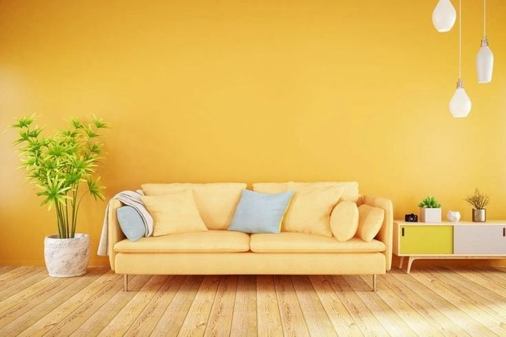
Yellow is often connected with sunshine, optimism, and happiness. When used carefully, it makes rooms feel brighter and more welcoming.
However, extremely bright yellow may become overwhelming if used throughout an entire room. Soft buttery shades usually feel much more comfortable.
Best places for yellow include:
- Kitchens
- Breakfast areas
- Entryways
- Small spaces needing brightness
Emotional Effects
- Cheerful
- Warm
- Friendly
- Positive
- Energetic
Red
Red naturally attracts attention. It creates excitement and energy, making it suitable for social areas where people gather.
Because it is such a bold color, many designers prefer using red as an accent rather than covering every wall.
Ideal locations include:
- Dining rooms
- Entertainment rooms
- Accent walls
Emotional Effects
- Passion
- Energy
- Excitement
- Confidence
- Warmth
Orange
Orange combines the warmth of red with the brightness of yellow. It creates an inviting atmosphere that feels energetic without being as intense as pure red.
It works particularly well in spaces where families spend time together.
Emotional Effects
- Friendly
- Creative
- Warm
- Motivating
- Social
Purple
Purple often creates a luxurious and creative feeling. Lighter lavender shades feel peaceful, while darker tones add elegance.
Many people choose soft purple for bedrooms because it combines calmness with personality.
Emotional Effects
- Creativity
- Imagination
- Luxury
- Relaxation
- Inspiration
White
White remains one of the most popular interior colors because it makes rooms feel clean, fresh, and open.
It also reflects natural light, making smaller rooms appear larger.
However, using only bright white throughout an entire home may make spaces feel cold. Adding wood furniture, plants, or colorful décor creates better balance.
Emotional Effects
- Cleanliness
- Freshness
- Simplicity
- Openness
- Peacefulness
Gray
Gray has become a favorite in modern interiors because it works with almost every decorating style.
Soft gray creates a calm background for furniture and artwork, while darker gray adds sophistication.
Emotional Effects
- Stability
- Balance
- Elegance
- Calmness
- Sophistication
Warm Colors vs Cool Colors
Before choosing paint, it helps to understand the difference between warm and cool colors. Each group creates a different feeling, so selecting the right one depends on how you want a room to be used.
Warm colors usually make a space feel lively and welcoming. Cool colors, on the other hand, create a peaceful and refreshing atmosphere. Neither is better than the other. The best choice depends on the room’s purpose.
| Feature | Warm Colors | Cool Colors |
|---|---|---|
| Common Colors | Red, Orange, Yellow | Blue, Green, Purple |
| Feeling | Cozy, energetic, inviting | Calm, peaceful, refreshing |
| Best For | Living rooms, kitchens, dining rooms | Bedrooms, bathrooms, home offices |
| Makes Room Feel | Smaller and warmer | Larger and more open |
If you want guests to feel comfortable and social, warm shades are often a great option. However, if your goal is relaxation or concentration, cool colors usually work better.
Best Colors for Every Room
Choosing paint becomes much easier when you think about what happens in each room every day.
Bedroom
The bedroom should help you unwind after a busy day. Soft and gentle colors encourage relaxation and support better sleep.
Best Choices
- Soft blue
- Sage green
- Light lavender
- Warm beige
- Soft gray
Avoid very bright reds or oranges if your goal is a peaceful sleeping environment.
Why They Work
These colors reduce visual stimulation and create a calm atmosphere. As a result, the room feels more restful.
Living Room
The living room is where families relax and guests gather. It should feel comfortable without becoming overwhelming.
Best Choices
- Warm beige
- Soft green
- Light gray
- Cream
- Earthy brown
These shades make conversations feel natural while allowing furniture and decorations to stand out.
Kitchen
The kitchen is often the busiest room in the house. Fresh, cheerful colors help create an inviting atmosphere.
Best Choices
- Soft yellow
- White
- Light green
- Warm cream
Some homeowners also use small red accents because they add warmth without overpowering the space.
Dining Room
A welcoming dining room encourages people to spend more time together.
Best Choices
- Warm terracotta
- Deep green
- Soft gold
- Beige
Rich colors can make meals feel more enjoyable while maintaining an elegant appearance.
Home Office
Working from home requires a space that supports concentration without feeling dull.
Best Choices
- Blue
- Green
- Soft gray
- White
These colors help reduce distractions while creating a professional environment.
Bathroom
Bathrooms benefit from colors that feel clean and refreshing.
Best Choices
- White
- Pale blue
- Sea green
- Light gray
Combined with natural light, these shades create a spa-like atmosphere.
How Lighting Changes Wall Color and Mood
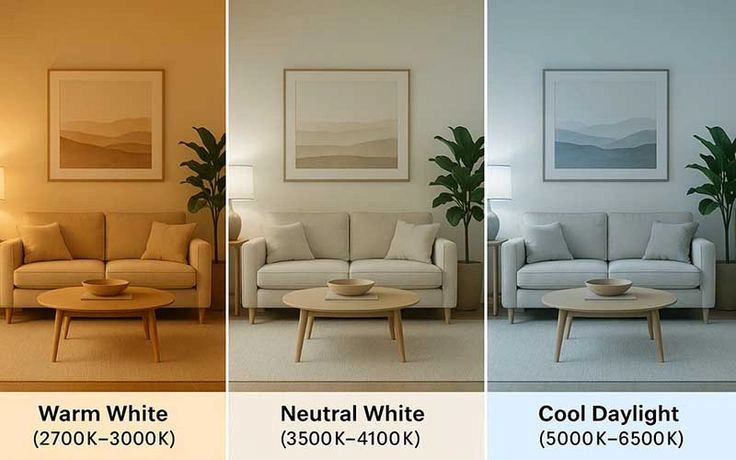
Even the perfect paint color can look different depending on lighting. Because of this, lighting should always be considered before making a final decision.
Natural daylight usually shows the truest version of a color. Morning sunlight often brings out cooler tones, while evening sunlight creates a warmer appearance.
Artificial lighting also changes how walls look.
| Lighting Type | Effect on Paint Color |
|---|---|
| Natural daylight | Shows true color |
| Warm LED lights | Makes colors appear warmer |
| Cool LED lights | Makes colors appear cooler |
| Dim lighting | Deepens darker shades |
| Bright lighting | Makes rooms feel larger |
Always test paint samples on different walls and check them throughout the day. This simple step can prevent expensive mistakes later.
Tips for Choosing the Right Paint Colors
Selecting paint becomes less stressful when you focus on how you want a room to feel instead of simply following trends.
Think About the Room’s Purpose
Ask yourself one simple question.
How should this room make people feel?
The answer will guide your color choices much better than current fashion.
Consider Natural Light
Rooms with large windows can handle darker shades more easily. Smaller rooms with limited sunlight often benefit from lighter colors.
Use Accent Colors Wisely
Instead of painting every wall with a bold color, use bright shades through artwork, cushions, rugs, or a single accent wall.
Test Before Painting
Paint samples look different on a wall than they do on a tiny color card. Testing several shades saves both time and money.
Keep the Whole Home Connected
Each room can have its own personality, but using similar undertones throughout the house creates a smooth flow from one space to another.
Common Mistakes to Avoid
Many homeowners choose paint based only on appearance. However, a beautiful color is not always the right color for your lifestyle.
Here are some common mistakes.
| Mistake | Better Approach |
|---|---|
| Choosing colors only because they are trendy | Pick colors that suit your daily routine |
| Ignoring lighting | Check colors at different times of day |
| Painting without testing | Use sample patches first |
| Using too many bold colors | Balance bold shades with neutral colors |
| Forgetting furniture colors | Match walls with existing décor |
| Copying online photos exactly | Consider your own lighting and room size |
Avoiding these mistakes makes it much easier to create a home that feels comfortable for years to come.
Simple Home Color Checklist
Before buying paint, ask yourself these questions.
- Does this color match the room’s purpose?
- Have I tested it in natural and artificial light?
- Does it work with my furniture?
- Will I still enjoy this color in a few years?
- Does it create the mood I want?
- Does it connect well with nearby rooms?
If you answer “yes” to most of these questions, you’re probably making a smart choice.
Frequently Asked Questions
What is the best color for reducing stress at home?
Soft blue and green are popular choices because they create a calm and relaxing environment.
Which wall color improves focus?
Blue, soft gray, and muted green are often preferred for home offices because they encourage concentration without feeling distracting.
Do dark wall colors always make rooms look smaller?
Not always. In rooms with plenty of natural light, darker colors can add depth and create a cozy atmosphere.
Can paint colors really affect mood?
Colors cannot completely control emotions, but they can influence how comfortable, energetic, or relaxed a space feels.
Should every room have a different color?
Not necessarily. Many homes look more balanced when similar tones are used throughout, with each room having small variations.
Conclusion
The relationship between home colors and emotions is about more than decoration. Every color contributes to the atmosphere of a room, influencing how welcoming, relaxing, or energetic it feels. By understanding color psychology home, you can make thoughtful choices that support your daily activities and personal style.
There is no single perfect color for every home. The best results come from considering the room’s purpose, lighting, furniture, and your own preferences. Testing paint samples and choosing shades that suit your lifestyle will help create spaces that remain comfortable long after the paint has dried.