A room can have beautiful furniture, soft lighting, and all the right finishing touches and still feel as though something is missing. Sometimes, that missing element is color. Other times, it is texture, personality, or a little connection to the natural world.
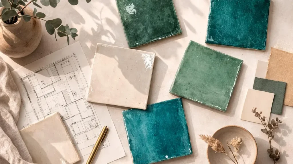
Color tiles offer a way to bring those elements together. From deep forest-green ceramic squares to sun-washed terracotta, playful geometric patterns, and delicate botanical motifs, colorful tiles can transform an ordinary wall, backsplash, windowsill, or garden corner into a feature worth noticing.
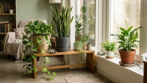
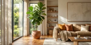
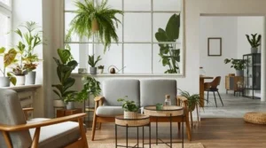
Add a few thoughtfully placed houseplants, and the effect becomes even more inviting. Glossy leaves soften the sharp lines of tile, natural foliage balances bold patterns, and earthy pots help the entire space feel connected rather than carefully staged.
The secret is knowing which colors work together, where patterned tiles make the greatest impact, and how to choose finishes that complement both your home and your plants.
What Are Color Tiles?
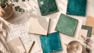
Color tiles are tiles available in different solid colors, shades, patterns, and decorative finishes. They are commonly made from ceramic, porcelain, natural stone, glass, or other materials, with each option offering different visual qualities and practical advantages.
Some color tiles create a quiet background for furniture and plants. Others become the main attraction through vivid hues, intricate designs, or contrasting grout lines.
Popular styles include:
- Solid-color tiles: Simple surfaces in colors such as sage green, navy blue, cream, blush, or charcoal.
- Patterned tiles: Decorative designs featuring geometric shapes, floral motifs, or repeating patterns.
- Terracotta-look tiles: Warm, earthy finishes that complement wooden furniture, clay pots, and leafy greenery.
- Glossy tiles: Reflective surfaces that can brighten a space when positioned thoughtfully.
- Matte tiles: Softer-looking finishes that often suit contemporary, rustic, and natural interiors.
- Mosaic tiles: Small pieces arranged into colorful compositions, borders, or decorative focal points.
The best choice depends on the room, the amount of natural light, the intended use, and the atmosphere you want to create.
1. Choose Tile Colors That Complement Your Plants
Plants introduce their own palette into a room. Foliage ranges from pale lime and silvery green to deep emerald, burgundy, and variegated combinations. Choosing tile colors with those natural variations in mind creates a more harmonious design.
Green Tiles for a Botanical Interior
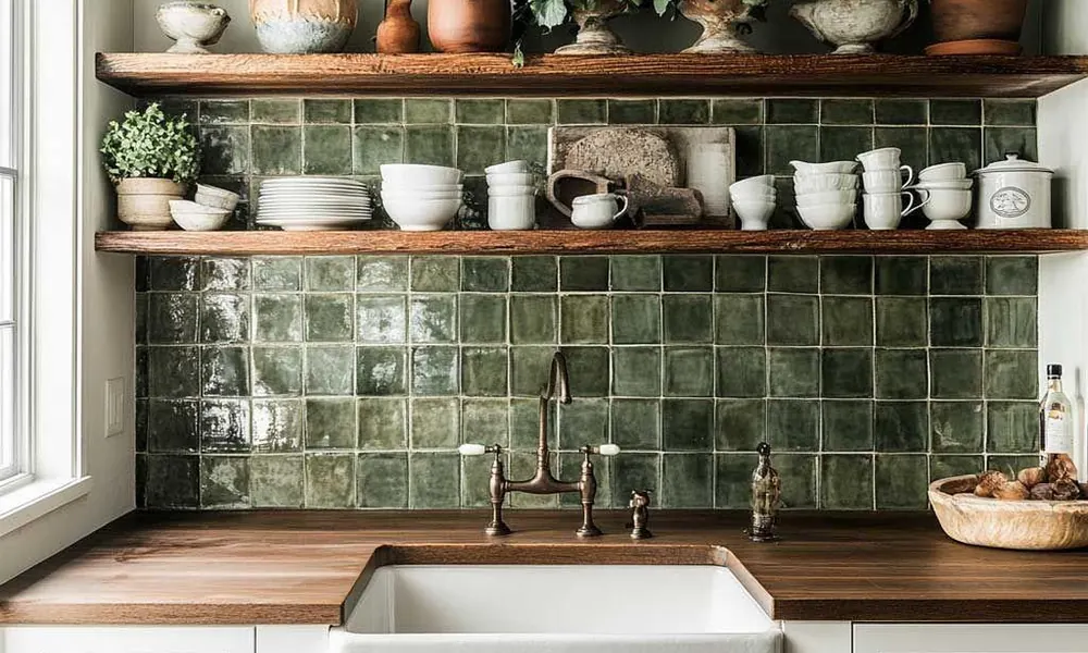
Green tiles are an intuitive choice for plant lovers because they echo the colors of foliage without requiring every surface to look identical.
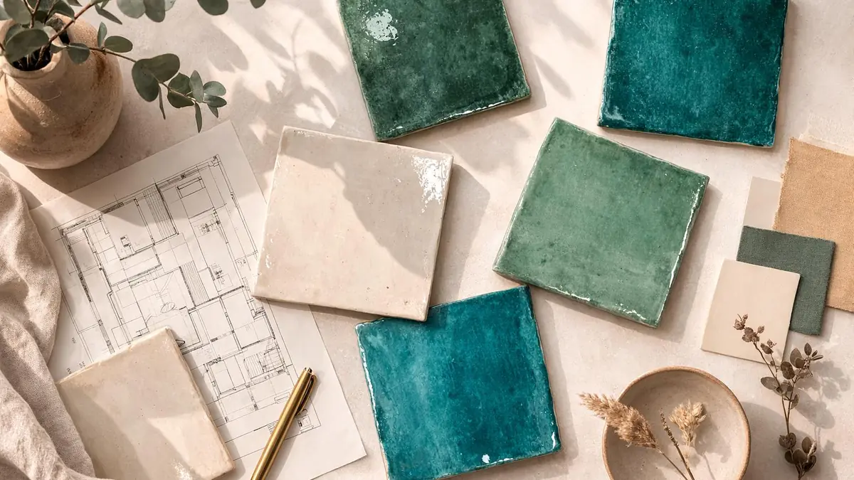
Sage and olive tiles create a softer atmosphere, while emerald or deep forest green can make a statement behind lighter foliage.
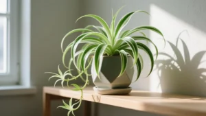
Try pairing green tiles with cream-colored planters, natural wood, and plants with contrasting leaf shapes. A trailing pothos or heartleaf philodendron can soften a tiled shelf, while a tall indoor plant introduces height beside a green accent wall.
Avoid matching every green shade exactly. Slight variations in tone and texture often make the arrangement feel more natural.
Terracotta and Earthy Neutral Tiles
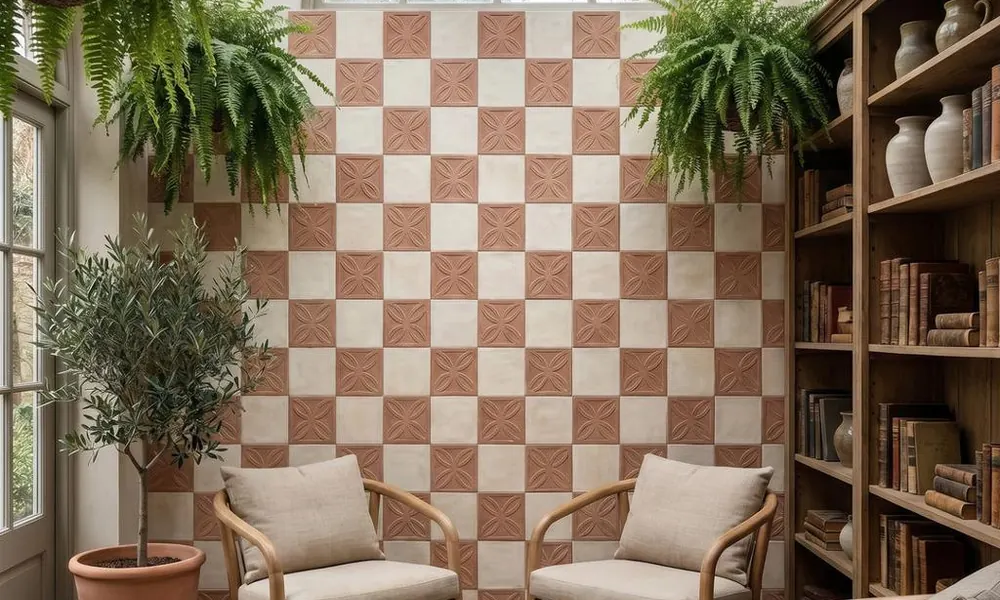
Terracotta-inspired colors bring warmth to interiors, especially when combined with plants in clay pots. Rust, ochre, warm beige, sand, and muted brown work well with natural materials such as wood, linen, rattan, and stone.
This palette is particularly effective for a sunlit reading nook, a plant-filled kitchen, or a small indoor garden. The warmth of the tiles contrasts beautifully with cool green leaves.
If the room already contains dark furniture, lighter terracotta or sandy tiles can introduce warmth without making the space feel heavy.
Blue Tiles for a Fresh, Calm Look
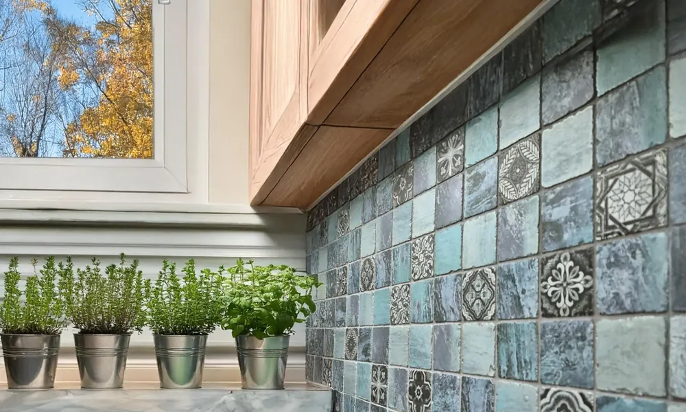
Blue tiles offer a different kind of contrast. Pale blue can create an airy background, while navy and cobalt provide depth and drama.
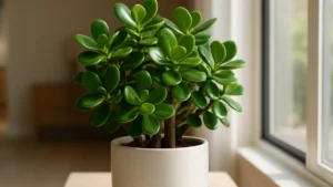
Pair blue tiles with green foliage, white planters, or light wood for a balanced look. Plants with rounded leaves create a softer visual contrast against the crisp lines of blue tile.
In a bathroom or kitchen, blue tiles can also connect decorative elements with the colors of water, glass, and natural stone.
White, Cream, and Neutral Tiles
Neutral tiles are useful when the plants themselves should remain the main attraction. Cream, ivory, and warm white provide a quiet background for patterned leaves, flowering plants, and colorful ceramic planters. They also make it easier to change accessories seasonally without redesigning the entire room.
For a more layered result, combine different textures rather than introducing many new colors. A matte tile, a woven basket, a wooden stand, and glossy foliage can create plenty of visual interest on their own.
2. Use Patterned Tiles to Create a Botanical Feature
Patterned tiles can bring the feeling of a garden into spaces where growing plants may be difficult.
Floral designs, leafy motifs, repeating geometric shapes, and Mediterranean-inspired patterns all offer different ways to introduce visual character.
A botanical tile backsplash can frame a kitchen herb garden. A patterned panel behind a plant shelf can turn a simple display into a focal point. Decorative tiles around an outdoor planting area can connect the garden with the architecture of the house.
The important thing is to give the pattern room to breathe. If the tiles have intricate designs, use simpler planters and restrained accessories nearby. If the tiles are relatively plain, colorful pots or plants with striking foliage can supply the detail.
3. The Best Ways to Combine Color Tiles and Indoor Plants
The relationship between tiles and plants changes depending on where you use them.
Kitchen Backsplashes and Herb Gardens
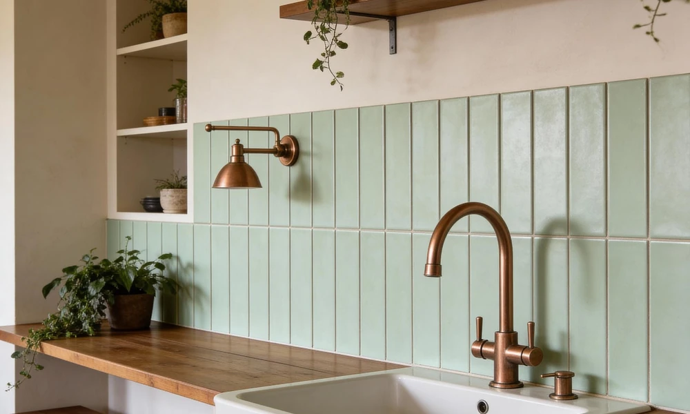
A tiled backsplash can make a kitchen herb garden feel like part of the room rather than an afterthought.
Green, cream, blue, and warm neutral tiles work particularly well with basil, mint, parsley, and other herbs, provided the plants receive suitable light.
Place herbs near a bright window or another appropriate light source. A beautiful backsplash cannot compensate for inadequate growing conditions.
Keep pots stable and leave enough room to clean the surface. If you use individual containers, make sure excess water can drain without damaging cabinetry or collecting on the counter.
Bathrooms With Colorful Tiles
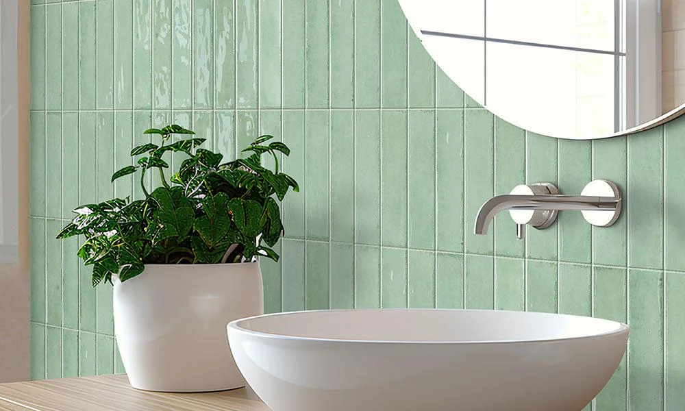
Bathrooms often offer an appealing combination of moisture, reflective surfaces, and decorative possibilities. Plants may thrive there when the available light, temperature, and humidity suit their needs.
Pair soft green, blue, or cream tiles with plants selected for the actual conditions in your bathroom. Some tropical foliage plants appreciate humidity, but many still require more light than a windowless bathroom provides.
Use waterproof saucers or appropriate outer pots, protect grout and surfaces from persistent moisture, and avoid placing plants where hot air or cold drafts repeatedly stress them.
Living Rooms and Plant Corners
In a living room, a colorful tiled hearth, decorative panel, or tiled side table can give a plant arrangement a sense of place.
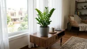
Use one prominent plant as an anchor, then add smaller plants at different heights. The tiles provide structure, while the foliage supplies movement and variation.
A tall plant beside a patterned tile feature can create a dramatic silhouette. Smaller plants with delicate leaves can soften the edges of a geometric design.
For additional inspiration, see room-by-room plant styling ideas.
Balconies, Patios, and Outdoor Plant Displays
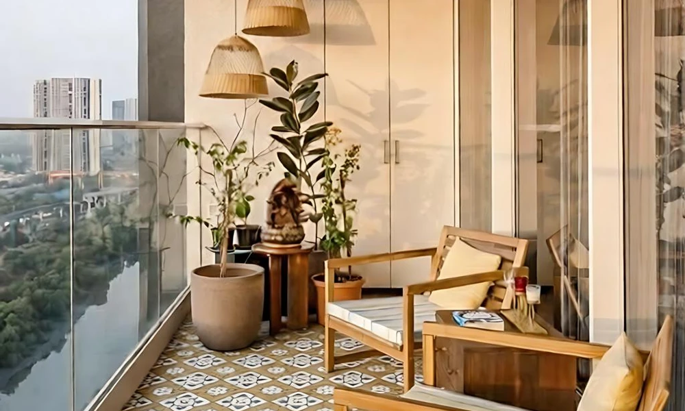
Color tiles can bring personality to outdoor planting areas, from a small apartment balcony to a larger patio.
Terracotta tones work well with clay pots and Mediterranean-style planting. Blue and white tiles create a crisp contrast with green foliage, while colorful mosaics can make a compact seating area feel more individual.
Before installing outdoor tiles, check that the material, surface texture, drainage, and installation system suit the local climate and exposure to moisture. Some finishes become slippery when wet, and not every tile is designed for freeze-thaw conditions.
4. Create a Color Palette Before Buying Tiles
One of the easiest ways to make a colorful room feel cohesive is to choose a small palette before shopping.
Start with the largest existing elements, such as the floor, walls, cabinetry, and furniture. Then consider the colors of your plants and planters.
A simple approach is to select three main colors:
- A foundation color: A neutral or restrained shade used across larger surfaces.
- A supporting color: A complementary tone that connects the tiles with furniture or accessories.
- An accent color: A brighter shade used sparingly to add personality.
For example, a plant-filled living room might combine warm cream, sage green, and terracotta. A more dramatic kitchen could use white, deep blue, and leafy green.
These combinations are starting points rather than strict rules. Natural light, room size, existing finishes, and personal taste all affect how colors appear.
Try These Plant-Friendly Color Combinations
Sage green, cream, and natural wood: A gentle palette for a relaxed, botanical interior.
Terracotta, sand, and olive: A warm combination for rustic spaces, clay planters, and sun-loving indoor plants.
Navy, white, and emerald: A higher-contrast look that suits modern interiors and plants with bold foliage.
Blush pink, ivory, and soft green: A lighter decorative palette for bedrooms, reading corners, or flowering plant displays.
Charcoal, warm gray, and lime green: A contemporary combination in which bright foliage becomes the focal point.
Before committing to a large tile order, request samples and view them at different times of day. A color that appears soft in a showroom may look much stronger under direct sunlight or artificial lighting.
5. Understand Tile Materials and Finishes
Color matters, but the material beneath it determines how a tile performs.
Ceramic Tiles
Ceramic tiles are available in many colors, patterns, and price ranges. They can be suitable for walls and selected floor applications, depending on the product’s specifications.
Check the manufacturer’s recommendations for the intended location, especially in wet areas.
Porcelain Tiles
Porcelain tiles are often chosen for their durability and relatively low water absorption. They can be a practical option for many floors, backsplashes, and outdoor applications when the product is specifically rated for those uses.
Surface texture and slip resistance remain important, particularly in bathrooms and exposed outdoor spaces.
Glass and Mosaic Tiles
Glass tiles can add brightness and visual depth, while mosaics offer opportunities for intricate patterns and accent details.
These finishes may work well for decorative panels or backsplashes, but the installation method, substrate, grout, and intended exposure should all be considered.
Matte or Glossy?
Glossy tiles reflect more light and can make a surface feel brighter. However, reflections can also emphasize water spots, fingerprints, and surface imperfections.
Matte tiles tend to create a quieter, less reflective appearance. On floors, choose a product with appropriate slip-resistance characteristics rather than relying on appearance alone.
6. Small-Space Decorating With Color Tiles and Plants
A small room does not need to be covered in bold patterns to feel colorful.
Choose one feature, such as a tiled backsplash, a narrow accent wall, or a decorative windowsill. Let that feature establish the palette, then repeat one or two of its colors in planters and accessories.
Vertical plant displays can help make use of limited floor space. A small plant stand can group containers neatly, while a trailing plant can introduce movement without requiring another large pot.
Remember that plants need more than an attractive display. Each variety must receive suitable light, watering, airflow, and growing space.
For additional ideas, explore Peeacelily’s guide to choosing pots and planters.
7. Common Mistakes to Avoid
Even attractive tiles can become difficult to live with when the practical details are overlooked.
Using too many competing patterns. Several intricate tile designs, colorful pots, and heavily patterned textiles can make a room feel visually crowded. Choose one dominant pattern and keep surrounding elements simpler.
Ignoring natural light. Dark tiles may appear dramatic in a bright room but can make a dim space feel heavier. Test samples under the lighting conditions you actually have.
Choosing tiles without considering maintenance. Textured surfaces, grout color, and the room’s exposure to water all affect cleaning requirements. Select materials suited to everyday use.
Putting plants where they cannot thrive. A plant may look perfect against a tiled wall but struggle if the location lacks sufficient light. Match the plant to the environment, not just the color scheme.
Allowing water to damage nearby surfaces. Use suitable drainage trays, wipe spills promptly, and avoid leaving standing water around wooden furniture, grout, or cabinetry.
Buying everything at once. Begin with tile samples and a few existing plants or pots. Once you understand how the colors work together, you can make more confident decisions about additional pieces.
FAQs
1. What color tiles go with a green plant wall or lots of houseplants?
Cream, warm white, terracotta, sage, and soft blue all work well. Neutral tiles let the foliage stand out, while terracotta adds warmth against cool green leaves. Avoid matching every green exactly, because slight variations look more natural.
2. Which color tile is best for a kitchen backsplash with herbs?
Green, cream, blue, and warm neutral tiles all suit herbs like basil, mint, and parsley. Choose the color you like, then place the herbs near a bright window, since the tile can’t make up for poor light.
3. Can you put plants in a bathroom with colorful tiles?
Yes, if the bathroom gets enough light. Some tropical plants like the humidity, but many still need more light than a windowless bathroom gives them. Use waterproof saucers and keep plants away from hot air and cold drafts.
4. What colors go well with terracotta tiles?
Olive green, sand, cream, and warm beige pair well with terracotta. Natural materials such as wood, linen, rattan, and stone also suit it. If your furniture is dark, lighter terracotta or sandy tiles will keep the room from feeling heavy.
5. Are patterned tiles too busy for a small room?
Not if you limit them to one feature, such as a backsplash, a narrow accent wall, or a windowsill. Keep everything else simpler and repeat only one or two of the tile’s colors in pots and accessories.
6. How do you pick a color palette for tiles?
Choose three colors: a foundation color for large surfaces, a supporting color that links the tile to furniture, and an accent color used sparingly. Start from what’s already in the room, such as floors, cabinets, and plants.
7. Are porcelain or ceramic tiles better for decorative walls and backsplashes?
Both work. Ceramic comes in a wide range of colors, patterns, and prices. Porcelain is often chosen for durability and low water absorption. Check the manufacturer’s rating for where you plan to install it, especially in wet or outdoor areas.
8. Should you choose matte or glossy tiles?
Glossy tiles reflect light and brighten a space, but they show water spots and fingerprints. Matte tiles look quieter and suit rustic and natural styles. On floors, choose by slip resistance, not looks.